Clear thinking.
Intelligent progress.
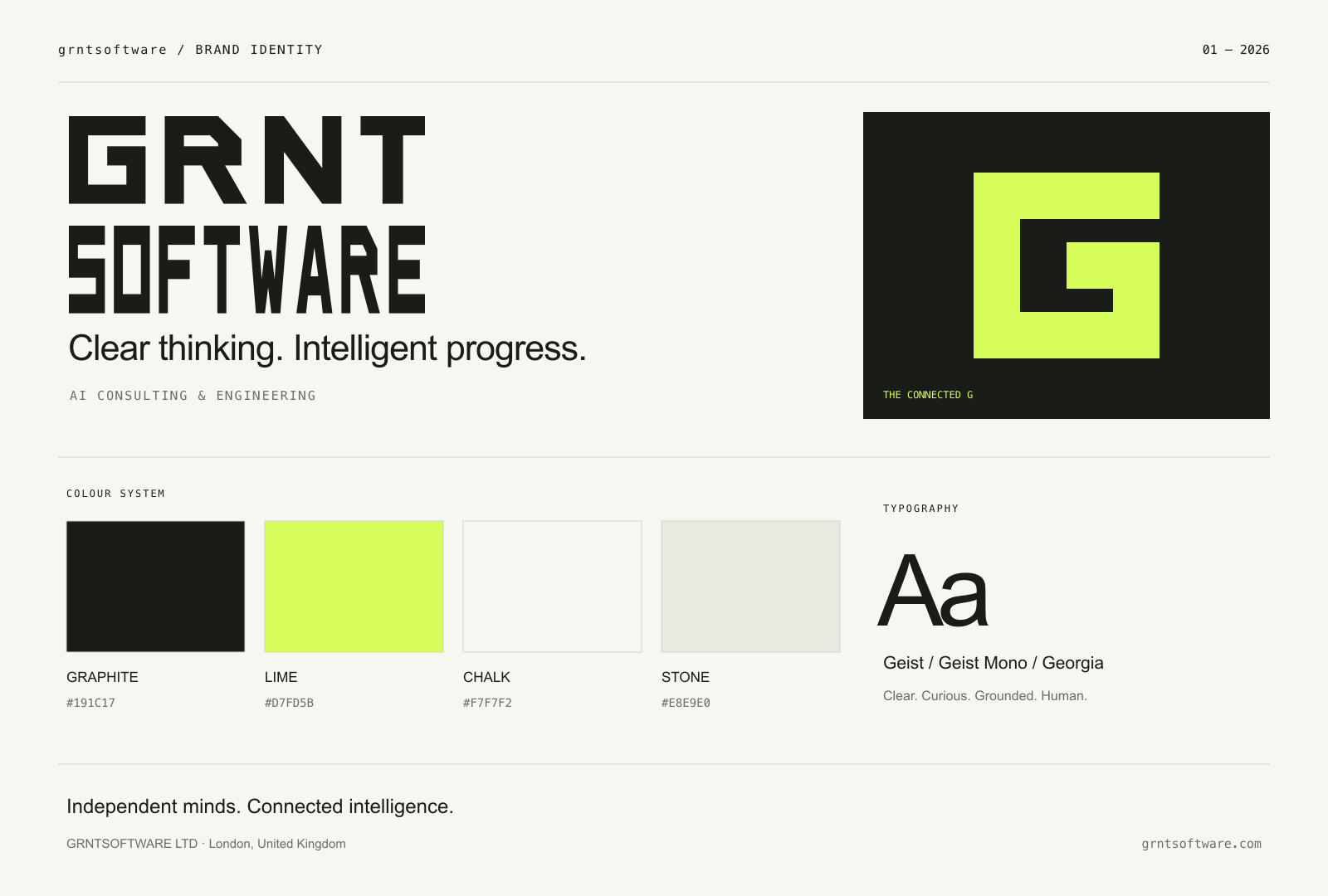
The grntsoftware identity brings clarity, curiosity, and a practical sense of optimism to AI consulting and engineering.
A thinking and building partner.
grntsoftware helps businesses turn AI possibilities into practical strategies, custom software, and connected workflows. We speak to decision-makers and teams who want to understand what AI can do for their work and put it into practice.
Brand promise: Clear thinking. Intelligent progress.
Website headline: AI consulting. Real advantage.
Campaign line: Less artificial. More advantage.
Descriptor: AI consulting & engineering.
Connected. Considered. Recognisable.
The stacked wordmark uses custom outlined letterforms: GRNT above SOFTWARE. Both lines have the same 260-unit width and 64-unit letter height, separated by a 16-unit gap. SOFTWARE uses condensed letterforms to keep both lines equal in size. The connected G creates a continuous path between intent and implementation. Use the full wordmark for introductions; use the G for favicons, avatars, and supporting graphics.
- Keep clear space of at least one quarter of the logo height on every side.
- Minimum wordmark width: 88 px on screen or 24 mm in print. Minimum symbol size: 24 px.
- Use Graphite on Chalk or Lime, and Chalk or Lime on Graphite.
- Scale proportionally. Do not rotate, stretch, add effects, change letter spacing, or place the mark on a busy background.
- Use SVG for sharp digital output and print workflows that accept vector files. PNG variants have transparent backgrounds.
A quiet foundation. An optimistic spark.
Graphite
#191C17Lime
#D7FD5BChalk
#F7F7F2Stone
#E8E9E0Use Chalk for breathing room and Graphite for text. Lime signals an important idea or invitation. Stone supports grouping and subtle backgrounds. Keep Graphite as the text colour on Lime. Do not use Lime as small text on a light background.
Colour codes are RGB digital specifications. For professional print, ask your printer for proofs and a CMYK conversion matched to the paper and printing process.
Clarity with a human inflection.
Primary family for headings, body, and interfaces. Prefer regular and medium weights. Use comfortable line spacing for body copy.
Georgia Italic adds a restrained editorial accent to a short phrase. Geist Mono handles labels, numbering, and technical details.
The website loads Geist and Geist Mono through Next.js. This standalone guide uses local font fallbacks. Font files are not bundled in this kit. Obtain Geist from its official distribution and retain its licence when redistributing. Use Arial, monospace, and Georgia as fallbacks.
Clear. Curious. Grounded. Human.
- Clear: Use plain language. Explain the business problem before the technology.
- Curious: Ask useful questions. Make room for context and different perspectives.
- Grounded: Describe the work and the intended outcome. Support claims with evidence; never invent results, clients, or guarantees.
- Human: Sound like a thoughtful partner. Be direct, collaborative, and warm.
Example: “Let’s find the right first step for your team.”
Give ideas room to breathe.
Use generous margins, a disciplined grid, fine dividing lines, and large left-aligned headings. Prefer open compositions over stacks of rounded cards. The connected G, precise linework, and simple geometric forms are the core graphic language. Use subtle motion, respect reduced-motion preferences, and keep keyboard focus visible.
GRNTSOFTWARE LTD
Company number: 17317526
Private limited company
Registered office: Unit 501 Leroy House, 434–436 Essex Road, London N1 3FY, United Kingdom
Contact: support@grntsoftware.com
Company and address details are reproduced from the Tinten contact page source. The contact email is supplied by grntsoftware. Tinten contact · Companies House record